


Let's say that you have a card component that looks like this:
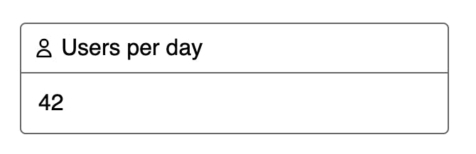
You could use this card on something like a dashboard and give it a unique header and icon to allow the user to differentiate what is being displayed.
A common way to design this component would be something like this:
<Card
  title={'Users per day'}
  icon={<UserIcon width={12} height={12} color={'#000'} />}
>
  {/* card body */}
</Card>
This just simply passes a react component with its own props directly into the icon prop. This is a totally fine way to do it and will work effectively, however we found that having to specify the width/height/color every time caused inconsistencies across the board when multiple developers would be using these components since unless they looked at a previous implementation, they would have to know what width/height you need.
We found a nice pattern that allows you to provide defaults for the icon at the component level, while still being able to override them easily when needed.
It gets broken down into 3 parts:
1. Unify your icon API
This assumes you use icons that have a standard API. Typically in apps i keep an icons/ folder that contains all the svgs we use that all take either { width, height, color } as props, or just a className that you can easily style with e.g. tailwind.
Here's a basic example:
export default function UserIcon({ width, height, color }) {
  return (
    <svg width={width} height={height}>
      <path fill={color} d="...." />
    </svg>
  )
}
2. Build the component that accepts dynamic icons
Here's what the implementation of the <Card /> component could look like:
Edit: updated 2021/04/02 to reflect comments about calling a component as a function
import React from 'react';

interface IconTypeProps {
  width: number;
  height: number;
  color: string;
}

type IconType = (props: IconTypeProps) => JSX.Element;

interface Props {
  title: string;
  icon: IconType;
}

function Card({title, icon, children}: PropsWithChildren<Props>) {
  return (
    <div>
      <header>
        {React.createElement(icon, { width: 12, height: 12, color: '#000' })}
        <h3>{title}</h3>
      </header>
      <div>
        {children}
      </div>
    </div>
  )
}
Let's break this down a bit:
interface IconTypeProps {
  width: number;
  height: number;
  color: string;
}

type IconType = (props: IconTypeProps) => JSX.Element;
The first thing we see are IconTypeProps which are the props your generic icons should take in. If we're referring to the initial example, all icons take in a width, height, color prop, but you should change this to match your icon API.
Next is the IconType. This just says: when used, pass us a function that takes in the generic icon props we defined before, and give us a react element in return.
I like to move these types into an external file and then export them so they can be reused easily in all of your components.
interface Props {
  title: string;
  icon: IconType;
}

function Card({title, icon, children}: PropsWithChildren<Props>) {
  return (
    <div>
      <header>
        {React.createElement(icon, { width: 12, height: 12, color: '#000' })}
        <h3>{title}</h3>
      </header>
      <div>
        {children}
      </div>
    </div>
  )
}
Now is the actual <Card /> implementation. Here you can see we define the props for the card to have a title that's a string (easy enough) and an icon prop that uses our new IconType to say we're expecting to be passed one of our normalized icon components.
When it comes time to render these, the title and children get rendered as normal but the icon prop we manually call React.createElement passing the icon prop as the first argument (the element to be created) and the default props as the second. The nice thing about this is that for this card class we may have different sizes/colors than if we wanted to use an icon say in an alert somewhere!
3. Passing icons to our new component
function Dashboard() {
  return (
    <div>
      <Card title={'Users per day'} icon={UserIcon}>
        24
      </Card>
      <Card
        title={'Posts per day'}
        icon={props => <PostIcon {...props} color={'#fff'} />}
      >
        181
      </Card>
    </div>
  )
}
Now you can see that we have two ways of using this. The first being just accepting the defaults that the component provides just by passing the icon component by reference:
<Card title={'Users per day'} icon={UserIcon}>
    24
</Card>
And the second by passing a callback, we can take the default props, spread them over our icon, and only override the ones we want to change
<Card
  title={'Posts per day'}
  icon={props => <PostIcon {...props} color={'#fff'} />}
>
  181
</Card>